My relationship with the nature is in the middle of being close and not close because there are times when I like to go out and take landscape photos this is because I found it very peaceful and relaxing to just be by my self or with my family. However there are also times when i just want ton stay in bed and not really connect with nature as much as I should. There are many different places I would go to construct a landscape image. For example I would go to the countryside or the woods or even the beach. These are my three main places. The reason why because I feel like I can take some really nice pictures especially of the sunset because I love how the colours complement each other to make a beautiful orange or pink. The reason why I chose the countryside is because I like how it has a wide range of space to take a lot of different photos. And the woods because I like how there is a lot of nature because it allows me to take a wide range of really nice photos. Many people take pictures of nature because it is a very relaxing and peaceful thing to do. They also take pictures of nature because something may have caught their eye or they saw something quite unique. I believe that photographs can change the way people see things because someone it might change the way people see different colours.
landscapes


These are just some of the images that came up when i search or landscapes online. I really like how all the colors combined with each other and compliment each other. However, if I was the one that took the top second to last photo I would try to add in more of the building because I don't like how it is half cut off in the image. I really like how the shadows are created in the last image this is because it really defines the outlines of the walls and all the cracks that are made within them.I also really like the fist one because of how calming it is I think it is because there are no objects or people within the frame leaving you there with nothing but your thoughts. another thing that is good about that photo is how the shadows on the water is crated and the lighting in general because I like how one side is more bright than the other as it makes me think of how on one side of your life it is bright and happy but you can also get another side which is quite sad and dull/dark.
Constructed landscapes


In this task we had to go out and take a range of 36 images or more of constructed landscapes. I mainly focused on taking pictures of the sky because i find it really pretty when the sunsets and the sky goes this beautiful pinky orange colour. I also like when its blue hour because i can turn out to have these beautiful pictures. The rest of my pictures a a mixture of plants and buildings.For example the bottom left one was when I took on a boat into London and we passed this area and i had to take a photo because I liked how there where these beautiful buildings and the share poking out in the background. For the the second photo in the bottom second one I also really like because it reminds me of a desert i also like how vibrant the pink flowers are. The one photo I think I could work on the image with the yellow car because it's quite boring and dull. I also think that I could have done the homework a bit better meaning I could have taken all of my images instead of using some photos that where already on my phone.
The idea of a landscape

|
This artist decided to go for a cowboy landscape image I really like how they have made it look like a cartoon with the could and the way the the focus is a bit off in a way. However, I don't like how the horse is half cut off in the frame because if it was not in the middle but a little more to the left then i feel like the image would be a bit better. I also really like how the lighting is in the photo because i like how the clouds or mist is all light blue but there are also specks of dark blue in there as well because i really think that it defines the image in a way.
|
Image two.
|
The artist has chosen to make a landscape image withe no objects or people within the the frame. This picture give off a really dull look as it is mostly all shades of brown and grey and the lighting in it is sort of off as on one side it creates these really dark shadows which looks to be going over or forming a hill where as on the other side of the photo there are some faint shadows in places but the rest it is mostly light. I also realised that this photo is not framed in the center it is sort of taken to the left side. Which I think is a good thing because if every photo was framed in the middle there would be no story to tell because they would all look the same.
|

Dafna Talmor - From the Constructed Landscapes II series.
|
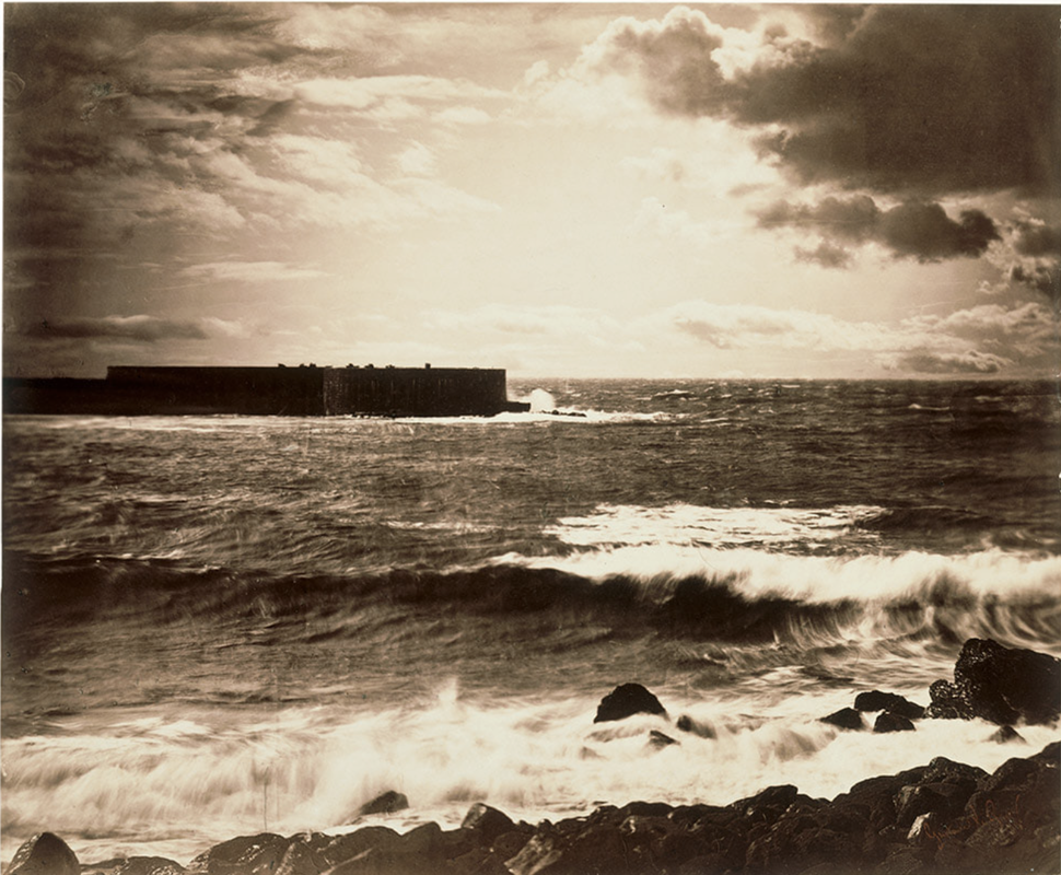
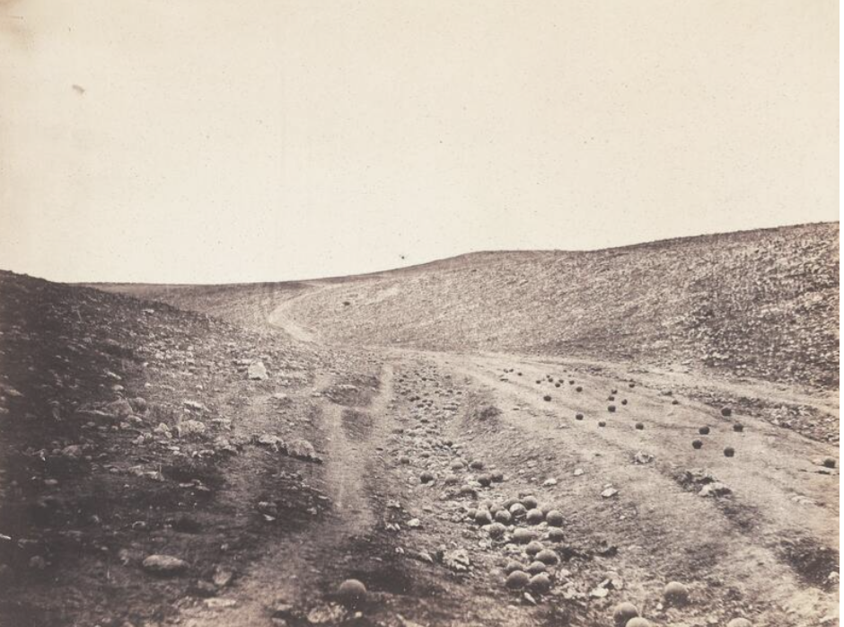
Gustave Le Gray - The Great Wave, 1857.
|
These two images are really similar because of the colour scheme. This is shown because they both have very dull toned colours. However both of them give me quite a calm feeling when I look at them. However one of them reminds me of the sea side because of the ripples of the water and the other one reminds me of the cracks in the middle of a stone.The tonal colours are very similar in both of these images are the same as well. I think my mist favourite image out of the two would have to be ' The Great Wave' This is because it reminds me of a place I went to as a child.
Minimalist landscapes: what remains.
Liz Nielsen- gardening with you 2020
|

Geraldo de Barros- sobras 1996
|
|
Liz Nielsen is an American photographer who lives and works in Brooklyn. Most of Nielsen's photographs are done without using a camera and is sometimes described as light paintings. She is known to work in the analog colour dark room which is where she exposes light sensitive paper and exposing is through a traditional colour chemistry each.
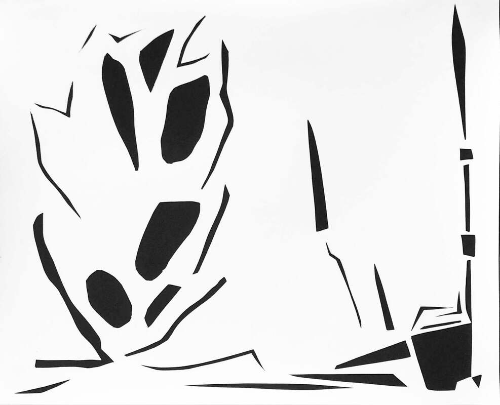
In this piece of work she has cut out different kinds of shapes with black paper. This is to show and define the outline of her garden. In this photo I can see a bunch with some gardening equipment and a pipe on the side. However I would say that she could have added a bit more black so that there wasn't so much light because this photo is making me feel like there is something missing and I think that it's because of the amount of space is left. |
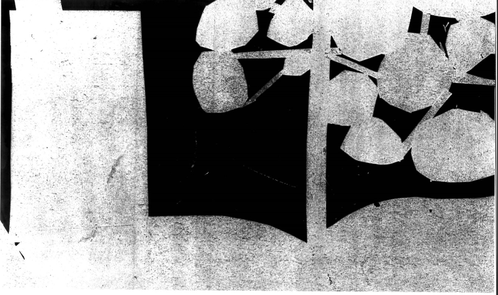
Geraldo De Barros is a Brazilian painter and photographer. He was well known for his fotoformas which is a series of photographs that uses of multiple exposures, rotated photos, and also abstract forms. This is so that he can capture a phenomenological image. I really like this image as it is unique and eye catching. However i'm not sure why the tree is floating and I don't like how the tree is cut out because you can see where it has been cut out and I think it makes it look sloppy. However, I like the detail of the tree against the black background because I think it makes the tree pop/ stand out more and gives the image character.
|
Minimal Landscape Experiment
Test 1
|
This was my first test of making a photogram of my minimal landscape experiment. I feel like this went really well because its not too bright but not too dark as well.The only thing i would change would have to be the way the lighter thing are a bit dark and grey I just feel like they could be a bit lighter.For this project I used ampeture 5.6 enlarger eight and I exposed it for only 5 seconds. but I feel like it could have been under there a second or too longer.
|
Test 2
|
This was my second test at the mineral landscape experiment I think that this test went a bit better because the lighter bit is more bright and less grey which I think was an improvement as in the last one more dark and dull and some parts of it blended into the black. but with this one u can see the lighter parts more clearly. In this test i think i need to work on making the tree lighter because it's still a little dull. I think I like this one more this time i used ampeture 5.6 enlarger eight but I exposed it for 6 seconds instead of 5 which is why I think some parts came out darker than the other. In my final test i want to make some parts a bit lighter than others.
|
Trip
|
|
today we went on a trip to the expedition of photography in London. the artist that caught my eye the most in there as a woman named Mandy Baker and she explored landscapes in photography as well. her work mostly consists of litter in the ocean and how much plastic the is in our bodies of water.This really amazed me and realise how much plastic there really is.One of here pieces was a photo of what looked like jelly fish but it was just two plastic bags of floating in a dark background another on of her pieces wasn't a photo but a piece of are i think she did and it was some of the plastic she collected but the gradually got smaller and smaller until there was nothing. i really liked here woke because i liked how she used the lighting in her photos to manipulate the way it looked. I also like how not all her photos were not framed in the middle because it made it a bit unique in a way. This was some of Mandy Baker's work.
|


Bill Armstrong


Bill Armstrong is a British based fine art photographer who has been shooting in colour for over 7 years.He produces lush, Semi abstract, semi figurative photographs.In this series I found out that he takes these photographs by taking intentionally blurred ed photos to invoke the sporadic and often temporal feeling at that moment.my first impressions on he work would be very positive and calm because i feel like when i look at his work it makes me feel happy in a way.For example with the bottom three there is more colour and more going on I would say.It is also more bright compared to the rest of them. The only over photo I would compare them to would be the first one because of how the flowers blend with the fields behind.This type of photograph would be called blurred landscapes this is done by making the photo go out of focus by placing and object in front of the back ground until the image goes out of focus and then removing it and taking the photo.Bill mostly photographs highways and I think that this because it makes him feel quite calm and content in a way as the highways he's taken images of look quite empty and like theres no distractions.He takes his photos to blend the collaged elements together and create seamless images.


These are some of the photos that i took in this lesson earlier this morning.I feel like I can do a bit more because I think that most of my photos are a bit boring and dull and with Bill Armstrong's work its simple but affective and there is more colour. But i also think that it had something to do with me doing this in school because I didn't have much access to brighter colours and most of the surrounding look the same in school. I definitely will be taking more photos over the weekend and at home as well because I feel like at home I will have better options and opportunities to take better photos in more abstract areas.When I look at my photos i feel bored but I also feel calm and content for some of them.For example, with the photos of the berries and the sky and trees i fell calm and content but with all the other photos Fell really bored. Except for the first bottom one because i like how the blue and the purple contrast and mix with each other. I also like how it makes me feel a bit more happy because of the nice bright colours.I have been exploring how to make out of focus landscape and in my opinion this was a good first try but it still needs a bit more work.These images show a rang of different areas of the school that caught my eye my personal favourite image would have to be the one with the orange highlighter because i like how calm and cool the green is and then you just have that pop of colour I think it make the image stand out more. However, i think my least favourite one would have to be the toe image on the second row with the fence and leaves coming out of the gaps.I just feel like this image could use more bright colours because right now this image looks really dull compared to the rest.
20 out of focus photos


These are all of my new attempts at taking photos inspired by Bill Armstrong. I think the one that looks the most like his work would have to be the image on the second row third from last this is because its very vibrant in colour and the majority of his work is also don with very vibrant bright colours. However, I think the one I need to work on a bit more would have to be the last image on the fourth row. This is because in this image there isn't really much going on and i think this makes the image look really dull and quit boring. Moreover I feel like with this piece of work I could have tried harder to make more difficult images and to push myself more to make a better outcome. In the next piece of work I will make sure to try and take more bright, vibrant, eye-catching images that will truly represent his work. I created these images by placing an object in front of the camera so that the background will be unfocused and then i took the photo making sure it was still out of focus I did this because this is the type of work i'm focusing on at the moment.
Diptychs


These are my versions of dyptics. With theses images I feel like I could have taken more landscapes because I didn't really have many to choose from which meant I didn't have many photos that would look nice and match together. However I feel like with the ones I have done I did a very good job. I really like the middle photograph because of the lighting and colours and I really like how the pink blend in with the greys and blues. I also really like how then end one turned out. The only thing I would change is hoe they turned out on the website because they are meant to be square but they came out all funny. I really like the the first one on the second row because I like how the colours clash and compliment with each other. However I don't really like the one after that because its not blurred and a bit basic. I am going to take more blurred images over the weekend and come back after school so that I can put them on my web sight and update them.
slide project


These are the slides I have done I originally had more however I chose to redo them because I didn't like how the first ones turned out. I am really proud of how these ones turned out because I like the details and lines I and I also like how the colour pops out because It makes It really nice to look like.
|
|
This is my video for my slide project I like how the colours of my slides have shown through nicely on the projector. However, I do think I could have done more than I did even if it was jut adding music in the background. That is something I will think about for the next video I do. However because it was my first time making something like this im quite proud of how it turned out.
|
Dafna Talmor constructed landscapes
|
|
In this video Dafna Talmor explains how and why she wants to make a utopian landscape. She makes utopian landscapes because she wants to discover and create a landscape that exists in her mind but not in real life things she wishes she could see in the real world. In this video she explains how she gets this overwhelming feeling when sh is out with her camera because she knows that there are no limits. Talmor makes her slides by taking a range of her own landscapes and the deconstructing them and adding another one to make it stand out more.
|
In my project I want to do better on getting the right colours that compliment each other I think I want to redo mine because I don't like how the the scratch desing went and i think i could do better so for this one
More landscape photographs.


in this piece of homework we had to take a range of 30 landscape 15 being an everyday landscape and 15 being a special place that you went to. However for me I did only 22 so i will need to improve on that for next time y 3 main special places where when I went camping, when we went to the chard in London, and when my mum went to Dubai she took these really nice landscapes for me.I really like the images of London in the night because of all the amazing lights and colours.However I didn't rally like the one on Black Heath because of how basic and boring it look and i feel like i could have done better by taking it at a better angle or a better view to make it more presentable.
Dionne Lee drafts
|
Drafts from Dionne Lee on Vimeo. |
In the video Dionne makes different collages with a rang of different photos. She does this by tearing these images up and putting them together to make a constructed landscape. Her landscapes remind me of Dafna Talmores utopian landscapes because she makes a landscape that isn't real in the real world but is in her imagination. This video made me feel really relaxing in a way because i like how it is in a blank quiet setting and i like the sound of paper tearing. However I found it quite confusing. Because it was really random and the finished product really unique. I also noticed that she took most of her images from what looked like magazines or books.
|
Response to Dionne Lee
|
|
This was my response to Dionne Lee's constructed landscape video. I definitely think that there is room to improve however for my first time iI am pleased with the results. I also want to improve on the time of my video because I do think that that it is a bit too long
|

This is my mind map of ideas for experiments as you can see I didn't do as many as I hoped to but that is something I can work on in the future. However I feel like this is enough for now and it gives me time and space to reform and add in anything I missed or any new Ideas that come to mind.
Penelope Umbrico


This the first option for my final project. However with a more detailed look in the other artists I have decided to change my artist because I fell like this is a bit easy and oI would like the chance for a larger range of experimentation and ideas.
Vilde Rolfsen


This Is the artist I went for his name is Vilde Rolfsen. This is his plastic bag project it was made up this project because he wanted to open the eyes to people and show them the issue with the amount of litter and plastic bags around the area. His work reminds me of mountains in a way or an icy environment ent because of all the defined lines and edges but i also like how it makes me think about my ideas on what it could be and it also allows me the use my imagination on what i want it to be.

|
This is one of his pieces of work. This one caught my eye the most because it reminds me of the blue hour. However it also reminds me of a massive ice glacier but the camera is placed inside of it. I like the lighting because i like how it progressively gets darker. Rolfsen actually didn't mean to make this project he did it because he was inspired by the colours and the inside of the bag so he took photographs of it. He took the photo by placing his camera inside of the at the angle he wanted and then he took the photo. This photo gives me an uneasy felling in a way because it looks like a cave with no way out in a way. I like how he's got different tones of blue in this piece of work because it makes it more nice to look at and it isn't just one tone or. This makes his work less dull or boring to look at.
|
Response to Vilde Rolfsen


These were the photos I took for the response to my artist Vilde Rolfse. I am really proud of how the photos in the plastic bags came out because I like how the light creates colours that mix and compliment each other. However I do feel like I could work on the photos where I used tissue paper and food colouring because I doesn't really relate to the rest of them or the artist piece of work. I also like how when the light makes all different colours I also like how the yellow of the light shines through the plastic bags.
Independent project.


This was the first part of my experiment I decided to print my images on different pieces of paper. normal, tracing, and cartilage paper. I did this because I want to do a book but it will have many different sections this is the first I am very proud of the outcome seeing as its my first attempt. however I need to do more and I also need to remember to make the fotos double sided otherwise it wont work in the book.
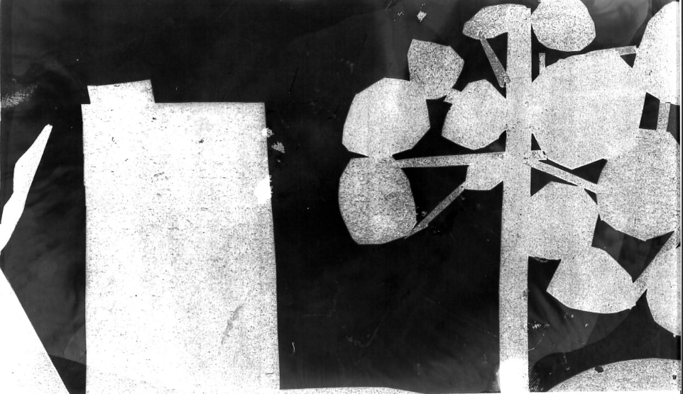
slides


These are part of my first experiment for my final project. I do need to do more slides because for my final project I want to have a collection of these projected in the background so that I can make a film of it. I don't like how the tape make lines and marks over the actual image because u can hardly see it. I hope that the marks and lines will even out when i put them into the projector. Im making slides for my final project because they will take part in the both of them the first one. is in a book I want to make a book with these slides as one section. And the second one will me as a film because I want them to be displayed in the background changing through for the film.
Homework


This is my homework i experimented more with the colours of the light. I like how it has more harsh and light tones of colours in these images. However I only took 28 photos so in my next piece I would like to do more because i know I can. I really like the last four because I like the pattern of the lights and how it forms on the camera. I took the last four images by colouring in the lights in different colours and placing my camera really close up so that it really shows the details of the lights I like them because they remind me of street lights. However I do think I need to work on these images a bit more by adding more colours or making it look like your not in a plastic bag anymore instead your in a utopian landscape.
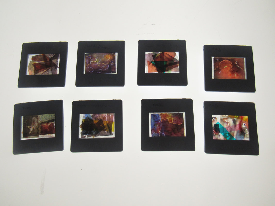
MY extra slides for making day.


These are some of the slide I am doing for my creation day I chose to do slides because they look nice and i want to make a film of them in the background in one of my projects. I like the colours of them and how they complement each other I also like how the coloured ink in some of them Have split and splattered everywhere ere spreading it out to make the colours of the images pop out more. However, I do want to make more because i feel like this amount isn’t t enough. I also want to get more creative in the making of the slides as well.


These are four of the slides i made projected as u acn see all the different colours
My first plan
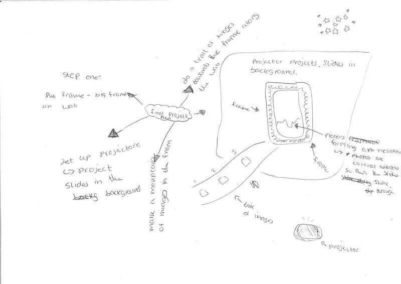
This is my first plan for my final project. My idea is to get a frame with a glass back and then i'm going to put my coloured hand made negatives in the frame on the glass as a landscape. The reason i'm doing handmade negatives is because they are clear and this will allow my slides in the background to show through. Im going to be taking the images and also making a small film of them being flicked through in the background. This piece is what i'm hoping to achieve on making day.


This is the book I made I really like how it turned out I like how my different images match and compliment each other. However I do think I was lazy in the making and i think thats something I can work on in the future. But because this was my first time making a book I think it turned out really well and if I make another book I will know how I can improve it to make it better and what I can keep the same as well.
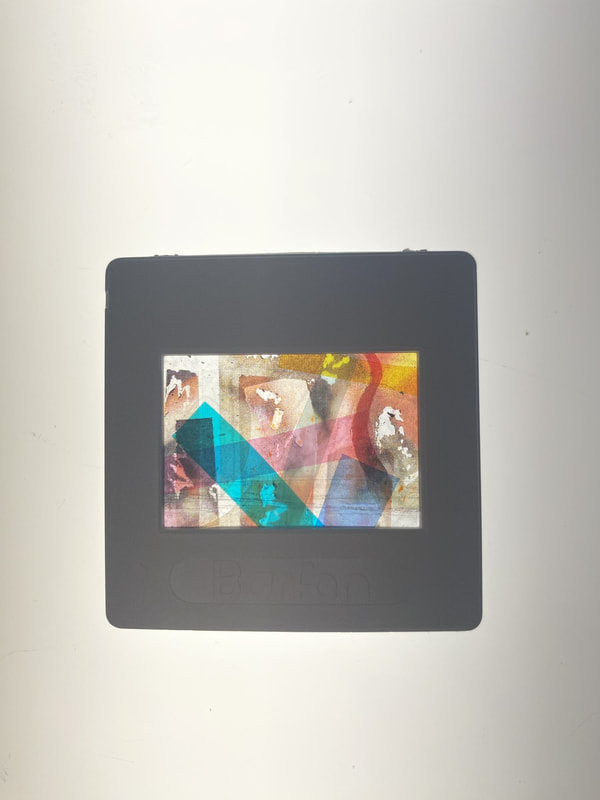
Slides
These are the final amount of slides I want to use for my final project I lek them because of how the coloured ink spread into each other and how in some of the coloured film makes it pop more. However i do think I need to manage my time more because I wanted to make more but I ran out of time. In my naext project I will make more and be more orginised with my time.


These are only a few of my slides that were projected I really like how the images is so messed up you cant see what it was like before. However I do need to find and project the rest of them.
