What is portraiture
portraiture is a photograph or a video of a person which can be a family member, friend, or even a random person walking down the street.There are a range of different kinds of portraits you can take. For example, you can take environmental portraits, traditional portraits, and lifestyles portraits there are so many more different types of portraits but those are the few that I can remember. We are studying portraiture because of the whole page Face Value on this page we are studying portraiture from the firs ever portraits to be taken to the most recent portraits to be taken. I like Portraiture because of the fact that you get to explore a range of different artists work and then try out taking some of our own following most of the rules the artist followed.
The first portraits to be taken
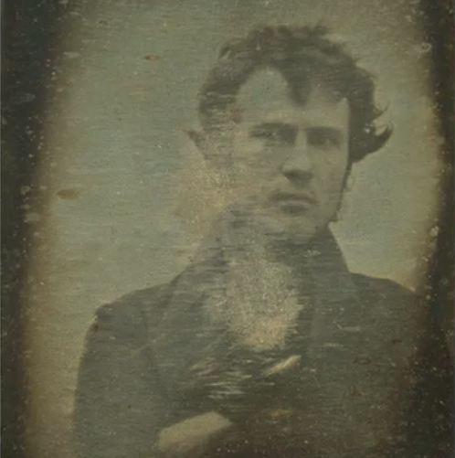
Robert Cornelius self-portrait 1839
|

Hippolyte Bayard self-portrait 1840
|
CornelThe similarities of these pictures is that they are both portraits and they were both taken at around the same time.The difference is that they are both different colours and they where both taken by different cameras. One of the pictures has a green colour to them whilst the other picture is al black and white.Robert Cornelius's photo was considered to be on of the first selfie to ever be taken.Robert was an amateur chemist and was also a photography enthusiast from Philadelphia. He took this photo by setting up his camera. ant the back of his families chandelier shop. Robert took this image by removing the lens cap on his camera and then running into the frame where he sat for a minute before covering up the lens again.And then on the back of his image he wrote"the first light image ever to be taken 1839". In the
Introduction
The portrait that i remember seeing was when i was little and I was in my house but we had this very nice picture of a woman she was in a black dress and she had a lovely black head scarf around her head. The portrait looks like it was painted but i can't really tell because it also looks like it was a drawing as well, There position was standing against a wall with a sort of dirty whit colour to it and her hand was covering her face so that you couldn't really see it but you could still see some of it. if i had to use 3-5 words to describe this they would be abstract,pretty,aesthetically pleasing, and bold. I found this portrait very interesting because it made ask a bunch of questions like why was she standing like that or what made the person that painted or draw this excetra.


Today we where recreating photos that we have seen in our childhood. The photo i chose was one that I have in my house and it was of a woman that was in a black dress with a lovely black headscarf on her head. As you can see in this photo my partner was covering her face in all of the pictures i took and that's because in the original picture her head scarf was covering her face but because the fabric we used was too short so we had to improvise and use her hand instead. Whilst in the process of making this i found it surprisingly easier than i thought it would be. But the most challenging bit was finding the fabric and then sorting it out so that it look as much alike as it was to the photo. the second most challenging bit was trying to bring her hair into the photo because i didn't want her to have two much hair in the photo because the photo didn't have that much of her hair in it. and then the final challenging part was getting the poses right as well because I didn't have an image of the photo on me at the time so I had to try and memories that detail as well.
recreation pt2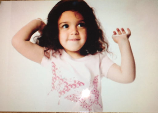
|
|


This was the photo I chose to recreate it was a photo I found on my phone so I decided to use this one. I found recreating this quite hard because the first two was of my friend Kristina and those where easy because I was taking the photo but for the two that I did of my self was quit difficult because I was still taking the photo but I had to stand it on something, get the correct lighting, and redo the photo over and over again until it was to my liking. for one of the photos I used one of the baby filters on snap and for the second one I used no filter but I still took the photo on snap. The two photos on the top was my version on recreating my baby photo.I really like how they turn out but turned out but if I had to chose one it would have to be the one with the baby filter because I think that that one really brings out the face I had when I was little.And I think I really pulled this off overall because when I was recreating it I not only had to think about my background but I also had to think about what clothes i was wearing because for the one of my friend we wasn't at her house or my house so we had to make do with what we got but luckily we could use the Tallis top to imitate the short sleeves top I was wearing but for me I was wearing a pink dress because I didn't have a pink t-shirt. For Kristina's photo i edited it and put a filter to make it a bit clearer. and for the two that I did I also added a filter so that it would look a bit like the one of me when I was little. My favourite picture would probably be the one that I took of me with the baby filter because it mimics the original picture really well in my opinion. I
Nico Froe workshop


Today we had a visitor and he was telling us about how he does photography and was showing us the work he had done in his life time and then we got to go out and take some photos of our own and these are some of the ones I took when I say some I mean that i originally took 26 but we could only pick 5-6 photos and these where some of my favourites. i really like the one of my friend and the one of my little sister. Because i like how i caught her at that time and that she was willing to take the photo because usually my sister doesn't want her picture taken so that was lucky i also like how i captured the people behind her. For the photo i took of my friend i like how I got it when she was smiling and i caught it at the perfect time too because it was when she was just about to get off the bench but i got it just in time so that it wasn't blury.


Nico Froehlich photographs environmental portraits which are portraits that have the local area in the background. This was also mentioned in his presentation in his photos I have realised that lighting is an important part of his work because in his photos he always uses the shadows in contrast of the photo.In have also noticed that he uses the colours to the background as well. For example in the photo where the little girl is on her bike she is wearing a red outfit with yellow straps so he took the photo of her standing in front of a yellow wall.In the frame of the picture he also has the people standing in the middle of the frame as well. on thing I like about his photos is that he takes the picture of the people in their everyday life so I doesn't have them in a certain pose of act a certain way he has them doing the thing they want to do. Nico photographs random people that he finds interesting so he asks for their permission and then takes the photos.The colours in the photos are usually very vibrant colours but the one thing that really surprised that in some of his photos the colours go really well. For example in the photo of the boy sitting in the basketball hoop i liked how his black tracksuit matched with the red fence in the background and the red rim of the basket ball hoop and also the white back of the basket ball hoop as well. Nico make South London look very unique he makes it so that it attracts people in it makes them want to look through more of his photos.
Nico Froe recreation


today we had to take another set of our own environmental portraits but outside of the school theses are some of the one that i took as you can see three of them where taken of my best friend Kristina where as the other three was not. one of them were of my baby sister Florence and the other two was of my little sister Eva one of her is in front of a shop in front of my house and the other one in front of Thomas Tallis. The one of my baby sister was of her in the care but there is my family home in the back ground. I chose this photo because i really like how I caught her smiling at the perfect time and how i caught the lighting as well.
Tyler Mitchell


Tyler Mitchel's reasons for tacking theses photos is because he wants to frame black people playing, relaxing and at leisure. For his work I feel like he is very unique because he has these ideas that people haven't seen before they are very original. the people in his photos are dressed sed in quite bright colours with bright back grounds in one of the photos there are two kids outside and they are dressed in quite dull coloured clothes but he had a bright red coloured balloon in the middle of the frame. And the colour of that ballon kind of evens out the colours a bit.Tyler Michell wants his work to be a sense of equality meaning he wants the normality of the lives of these people can live in a public place. Tyler Michell uses things like bright colours, young people, shadows, and props in his photos as well. He uses his work to evoke conversations about innocence and the truth behind the eyes of black people.
portraits


today we had to take portraits of you partner in a range of different styles and poses.I really like the bottom left photo because of the lighting and the way i took it. because at the time she didn't know i was taking the photo because she was taking a photo of me. I also really like the top middle and right one because i like how it was framed and the way the leaves of the tree are in half of the photo and how the shadows and the sun rally make the photo pop out a bit. I also really like the lighting in the bottom left one because i like how the shadows of our silhouettes are framed in either side of the photo and how it blocked out parts of the light.
Tyler Mitchell


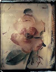
These are all the images that I took on the trip the first six where from the first gallery we went to and in the gallery it displayed few different pieces of Tyler Mitchell's work as you can see he likes to take portraits of young black people. I really like his work because he's very unique .I like how his work is very colourful and yet dull at the same time my favourite photo would have the be the bottom middle one this is because i like how the flowers are emerging form the water.Because i like how it kind of represents a sense of life and how things grow over time. I also like how the Lillie-pads and water grass float around in the background of the photo. Another thing I like is how the rays of the sun cut through the photo this is because of how it brings a sense of happiness to the photo and without it other than the pink of the flower the photo will be dull and lonely. However, one thing I would change in this photo would have to be how they are framed this is because I don't like how one of the flowers are in the middle and the other one is slightly cut out of the photo.
supply lesson

Similarities: In both of the pictures the photographer is a girl,and they are both self portrait.Differences:One of the photos are done in colour and the other photo is in black and white,an one of the photos was taken in 2013 where as the other image was taken in 1953.IN Viviane Sassen's photo she uses quite a bit of colour weather that being the white background or the blue light reflecting onto he face to the green jumper she was wearing at the time.However in Vivian Miaer's photo there is no colour because the photo was taken in black and white. in the coloured photograph it looks like she is in the corner of the room. But in the black and white photo the picture looks like it was taken in the middle of the street where she has lots of space around her. both of the photos are centerd meaning they where taken with the people standing in the center of the photo.I feel like the photograph made in 2013 was a staged photograph just because she is posed in a certain way and the blue light coming off of her face.It looks like she was made to stand there so that you could get the perfect angle.Where as in the photograph taken in 1953 it looks like she took the photo out of instinct because it sort of looks like she was walking saw this mirror in front of a shop or something she could see her reflection in and think that it was a perfect place to take a picture . Another reason why i think this is because in Vivian Miaer's photo you can see her taking the the photo with her camera but in the other photo you cant see her taking the photo which also makes me think that it was staged. In Sassen's photograph there isn't really that much to the background and that being because it's just a plain white background. But with Marier's photograph you can see a woman in the background and the streets and road and the cars in the background as well.Another thing that you can see in Mariaer's photo would be the tool apartment buildings or the office block behind her as well. The photo that I would probably prefer would be the coloured one because i really like how all the colours go together and how she is stood. The image reminds me of when you get a brain freeze and it feels like your hole brain has turned blue. I think the black and whit one lost by a little bit because I would really want to see that image in colour. to be able to see how it all looked at that time. I would say that Sassen's photo is kind of abstract because it is sort of seeking to achieve it's affect by using colour and texture.
supply lesson 2


These were one of our first ever self portraits that we took. In this task we had to take a range of four photos of your reflection these can be in front of a mirror, photo, or door frame. My most favourite photo would have to be the top right one or the bottom right one. This is because I like the lighting or how it was framed. My least favourite one would have to be the bottom right one this is because you can really see me and I didn’t frame it very well. If I did this again then I would take my time and care my about how and where I take the photos.Another hing I would like to change would have to be the ideas and thoughts in my head in the making of my photo This is because in the making of these photo i had really boring thoughts of where and how I can take this photo And I think if I had used my imagination a bit more than I could have turn out with quite a good selection of photos to choose from.
The elements of a portrait


Today we took a bunch of different kinds of self portraits the portraits that we had to take where one of a travel pass photo, that other was one of a police mug shot, and then there was one of a family portrait, and finally we took a normal self portrait. i took them all of my partner Kristina and she took all of them of me.My favourite one is probably family portrait because i like how Simran and Kristina are like mother and daughter and Rees is standing the like the awkward brother. i also like how the lockers in the back look like a wierd wallpaper sort of and the orange floor matches with it sort of.
The relationships between portraits in art and photography


Today we had to recreate different paintings and me and my partner chose to do the picture of ophelia John Everett Millais 1851-52. I think that the lighting and the colours are nice because i like how the light bounce's off of Kristina of but also how the shadows are in the photos the other thing that I like about these photos is the spot that we took the photo in. This is because it is almost an exact replica of the original painting. I found the outfit to be hard to recreate this is because we didn’t have a dress in the art cupboard or the photography cupboard.
Recreation part2


Today we had to recreate painting from a famous artist the picture I chose was 'The Girl with The Pearl earring'. The reason why I chose this was because it was the easiest to recreate and I really like how the painter angled their painting and how the lighting is contrasted in the photo.The only thing that I would trade about this would be the earring because at the time I didn't have an actually have a pearl earring but I did have a bracelet that looked like the pearl earring but the only problem is that it droops down and rally doesn't look like a pearl earring I would rather just having an earring in my ear or tucking away the bracelet so it looked more like an earring than it does in that photo.
cyanotypes


A cyanotype is a slow reacting, economical photographic printing formulation. Which is sensitive to a limited near ultraviolet and blue light. To develop a cyanotype, you will have washed the paper in plain water and then the areas that are exposed to the light will become a light blue colour and middle tones. And then the rest of the background is a more darker tone of blue. I think that the most satisfying thing about making cyanotypes is seeing how the objects that u chose become one with the paper and produces a beautiful picture.
photograms.
|
|
|
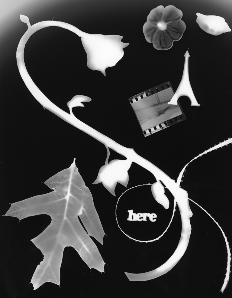
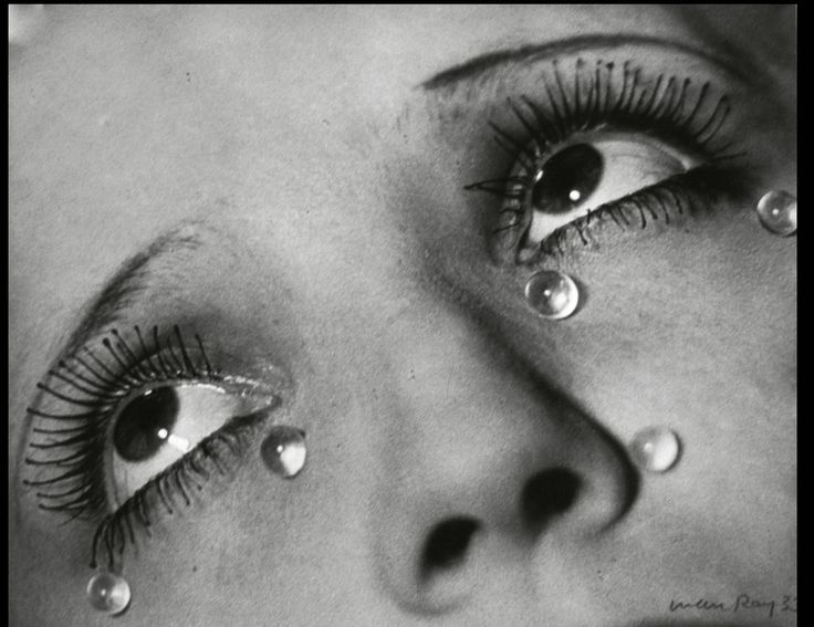
Man Ray
A photogram is a picture produced with photographic materials, such as light sensitive paper without a camera then exposing it to light. The image should come out as a negative with different toes of whit from where the object and materials have been. For this project you can use a range of different materials such as keys, patterned cloth, leaves, sticks, books, Jewlery, rubbish and more. As you can see, I have two different types of photograms on my website made by two different artists' one of the photograms was made by a man called Man Ray. For me I really like how he has added plants and flowers but also a bunch of random things like the word her and the Ifle Tower and the piece of string with the Miny photograph as well. The second photogram was made by a man called Mark Magnan. The thing that I like about his phots are how he has made it of a man and a woman I like how the detail of the woman's hair has shown through the photogram as well. The other things that I like are how the details of the man's hat has shown through as well as the hands and feet in the photogram. The following formal elements the both of them have used are line texture, shape, and tone. I would say that Mark's work differs from Ray's work because Ray's work is more about capturing the assents of life whereas Marks work is all about capturing the life of people in my opinion.
self portraits


For this homework we had to take a range of self portraits but we had to hide our face in some way with an object or your hands. I really like the top left one and the top right one because I like how they o
Light workshop
There where two different types of light in this workshop one of them was called an filament bulb\light and the other two was called LED varsa lights. for the LED lights there are arrows on the back so that you can control the intensity of the light there was also panels that you could move around on the light so that you could manipulate the light they where also there so that you could manipulate where you want the shadows ti be in you picture. Where as for the filament light it has different switches on the so that you can change the intensity of the light there is also a thing call a diffusion where it goes from a harsh light to a sort of calm light. you could also use tis on the LED lights. Another way you can add to the photo is to add gels to the LED lights because that gives the photo some colour. but you can only use this on the.
Self Portraits


today we had to take a range of self portraits. My favourite photo has to be the bottom right one. This is because I like how my hand is blocking the sun creating a shadow. The only thing that i would want to work on would be the framework ing.Because I believe that the photo would look a lot better if I was in the centre er of it. But other than that i really like how the photo turned out.However, the photo that I think needs some work would have to be the bottom left one this is because the photo to me is really Basic . I would have liked it if there was a bit more colour and if the lighting was better than it was. i think if I did that then it would have made the photo stand out more and kind of pop.
Final Self Portraits


Today we had to take a series of self portraits. We could either go on the 1st or 2nd floor of block one or around the outside of it. My favourite photo would have to be the bottom left one or the bottom right on. I chose these two because I like the of the lighting and the framing of the photo. However, my least favourite photos would have to be the top left and the top middle.This is because you can’t really see my face in those photos. And I don’t like the angles of the photo as well.
Ranking destroy projects


I really like this mans work because il like how different on how all the other artists work and i like how he uses a range of different colours to make his artwork really pop out to everyone.Another reason why i like it is because he dosen't care what people think about his work and if they like it or not he just cares about how the people look and how he can make his photos better in his next project
Destroying images
Today we destroyed the self portraits of our selfs. I decided to go for the image of me sitting on one of the benches in our school. I chose this one because i liked how the light from the sun reflecting off of my hair and face . I also like how clear the sky was that day because it made the photo that much more clearer. After I put my picture on photo pea i went on the filter option and chose liquify. After that i decided that i didn't want to liquify my face so I did all of the background instead because I thought that that that would look quite cool and it did after that i put a filter on which gave it that cartoony look and then after that i added it to my website. I got this idea off of and artist called Ranking. He is an artist that takes photos of famous people and then destroys them. I like his work because he uses a rang of different skills and colours to make the image really pop out of the frame and I like that kind of work because its very eye-catching.

|

|
colour mix self portrait

Today we where colour mixing our self portraits. I really like the style of my image I like how the pink and blue mixed together to make this really nice violet purple. Another thing that I like about this pice of work is how the two colours break apart to their self. The only problems that i had within the making of this project was deciding on what photo i wanted to use and the other problem was actually getting the colours to mix together and make what i have made now. The first few times I tried this did't go well because the two of my colours would come out but not the way i wanted because on would she but the other would come out on the other side of the photo. After that happening many many times i finally got them to show on the same page but i accidentally somehow got the colour to be too dark so the lighter colour didn't show through. Finally i tried again and this was the finish product.
Cindy Sherman
Today we made photograms and cyanotypes my favourite one out of the both of them would have to be the cyanotype because I like how i did the heart out of string with the ruler cutting through it. I also like how the blue lightens as soon as it hits the string heart. I also like how i am perfectly in the middle of the heart. the only thing that i would change about it would be how the picture uploaded onto the website. This is because of how wonky they are and how they aren't fully in the middle of the frame. Another thing that i do not like is the background of my photo/ the picture i chose for this product because i don't like the way i stand in the photo and the way the stuff in the background are just there in the way like i just annoys me. However, I do like how the string and glass sphere


This is an artist called Cindy Sherman she is an American photographer. This is just one of the different types of genres that she does. This particular one is called self-portraits. For her pictures she dresses up as a range of different characters. I have also noticed that the images would focus on her and the only blur the background a tiny bit. Shermans photographs often interpreted as feminist art.Her work is not just self portraits it's like she has made a film with photos like here photos are basically films in stop motion.she also has done different genres in here time. She uses the people in her photos to express her emotions towards the photo.
30 self-portraits


For this piece of homework we had to take a range of 30 different types of self-portraits based on a certain artist. The artist i chose was called Cindy Sherman and I chose her because her work really opened my eyes as a young photographer and I really like the types of work that she does. i really like to take self-portraits because there are a lot of different ideas to use and ways that you can take make the photo pop out a bit. The only time consuming thing that i kind if got board of was having to do outfit changes because I had a lot of rally good ideas but they all required a type of outfit so I had to organise it so that i could make it work. The thing that i am not proud of in the process of this homework was that I did eventually run out of ideas so as a result of this i decided to reuse some of the photos I already had on my website and it worked but now that I look back on it i wish i had a break and thought of some new if ideas and then went and produced those ideas ready to put on my website. Because I think that that would have have a better outcome on this work.
mirrored photographs


for this homework i had to take a range of 30 photographs using a mirror a part of you body and an object of you choice. for me i didn't really know about the artist at the time or have any ideas but i was at my friends house and she had this mirror and thats when i thought of the idea of these photos i have taken now. For now I have only got 8 photographs and thats because i didn't have the time to get to email them from my computer. However, i do want to retake a few because no i have a fresh understanding of the artists work and i feel like i can produce a better range of photos. I took these photos on my phone as u can see but I intend to get my little sister taking the photos for the retakes because I think that i can produce a better product with them other than me taking the photos.
20 self-portraits


For this homework we had to take a series of 20 self portraits of your choice i decided to go very simple and have two main outfits. one of my out fits was this multi-coloured tracksuit and the other outfit was this blue and white checked jumper with a grey skirt and white knee high socks I really like the photos I took with the filters on because of how it makes them have that really old fashion look. However I would have to say my least favourite one would have to be the top right one (the one with my hand covering my face) because it is the most simple boring one there and I think that if I used my imagination a bit more than I could have come up with something a lot better than that. But I think it's because after i think that there is nothing more I can do i will always turn to that idea when deep down I know that I could have done so much better.I think that that is the main thing that I needed to work on. in this project.
My final piece
for my plan I would like to make a range of different thing. the first thing that i was to explore is taking different types of self portraits the first kind would be exploring using a range of different filters to make the photos pop out in a way. The second type of self portraits i want to try is when someone els takes the photo for me by that move the camera so the background i blurred . The next thing that i would like to try is making a few photograms. Because i have a few ideas on how i'm going to display them. or the displays I want to use white board and organise the photos out on them by writing the title on top so that people know what they are. i also want to try and make a few cyanotypes.
self portraits.


Plan for final project

This is my final plan for my final project.This helps me know where everything goes it also helps me keep everything organised.
final plan

I didn't like my first attempt to lay out theses images so I decided to change it to something more relatable. For this final piece I wanted to have a massive frame with a staircase of photos going up to it and since I couldn't get a frame from school I thought i could make one my self. With that i can come back after school and set it all up because i want to have photos going up to the frame but I had to think about how they where going to stay up so i thought i could stick some phots in and around the frame and then hang the rest of them form the frame so that it will look like they are floating. I will also be hanging the frame from the roof. The only problem I have to think about is making the frame light enough to be able to hang from the roof but also strong enough to hold all the photos.
